Pages
Pages are a fundamental concept in Rapid Platform. A Page in Explorer hosts components and displays information as configured in Designer. Every component needs a Page on which it can be hosted. Pages enable adding, editing, and viewing data based on the nature of the components hosted on it.
Pages can host groups of items, or display information regarding a single item.
- List page – This is a page that hosts the information about a list of items from a table.
- Single item page – These pages host information about unique items in the Rapid database. These types of pages may include an item Details page, Activity page, Files page, Tasks page, or other custom pages.
Accessing a List Page in Explorer
- Click on the Explorer button in the bottom left corner of the site.
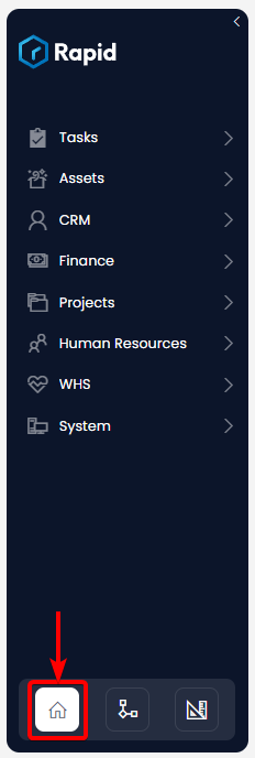
The background of the button will turn white to indicate which experience is currently selected (in this case, Explorer).
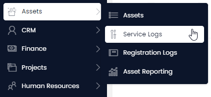
- Select the table title from the Sidebar menu. (In this example, we will navigate to the Service Logs table, underneath the Assets folder).
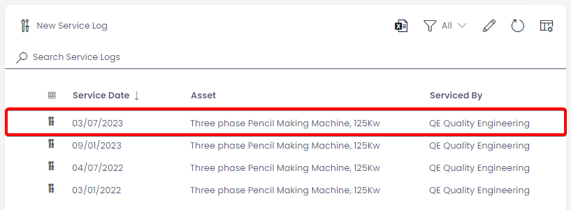
- Once a table has been selected from the Sidebar, Rapid will display a List page to present the table's items.
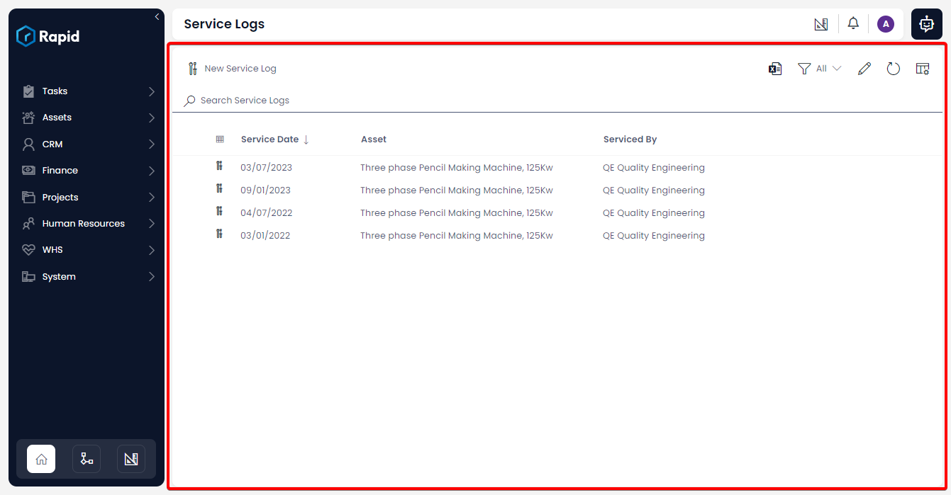
The area marked in red denotes a page. This page is hosting a Data Table component, which displays all of the items contained in a specific table. In this example, the data table is displaying all of the Service Logs. The List Page can be configured via Designer to host other page components as well.
- You can read more about the Data Table component here
- You can also learn more about how to view data within Data Tables
Accessing a Single Item Page
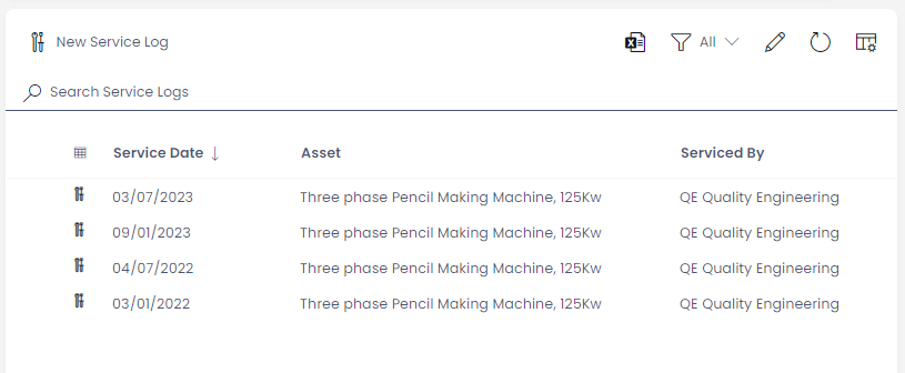
Pages can also display data for a single Rapid database item. To navigate to a single item page from the list page by clicking on either the title of the item, its icon, or double-clicking anywhere on the row of the item.
Above: A single item in a Data Table
Rapid items can contain a multiple pages. If several pages are connected to a Rapid item, they will appear in the Tab Strip. Here, you can switch between multiple Single Item Pages, which contain data about the current item selected.
There are four default pages in an item. These are:
- Details Page
- Activity
- Files
- Tasks
The Tasks item page may not appear on certain items' tab strips. This is because the Tasks page is set to inactive by default. Your system builder can enable the Tasks page for items in Designer.
- Custom pages can be created in Designer and linked to items.
Details Page
The Details page can be configured to display information about the database item. In the example below, the page renders data regarding a Service Log's: Asset, Service Date and who the asset was Serviced By.
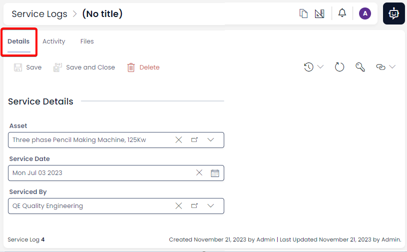
Usually, the Details page will host a Form Component. However, other components may be placed on a page as well. The Command Bar on an item contains several useful buttons such as Save, Save and Close, Delete, etc.
You can learn more about the functionality of the Details page, and:
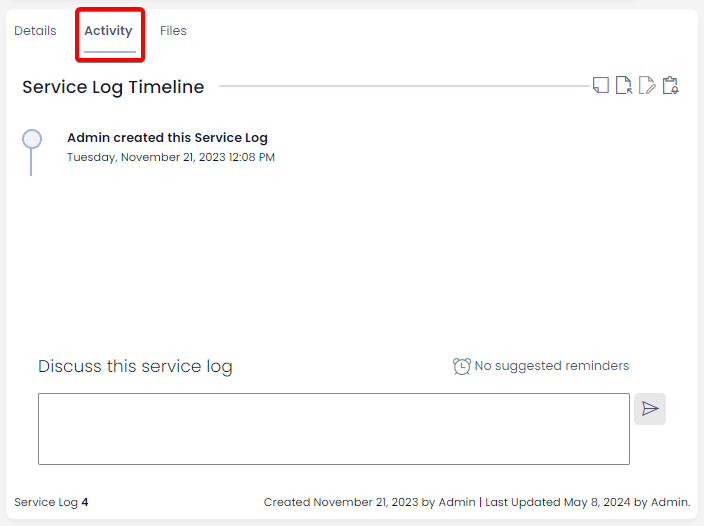
Activity Page
The Activity page hosts the Activity Feed Component. This page displays the ledger of item creation and lists all the changes that the item has gone through, with respective timestamps and other details.
Files Page
Files page allows a user to attach relevant folder(s) and/or file(s) to an item.
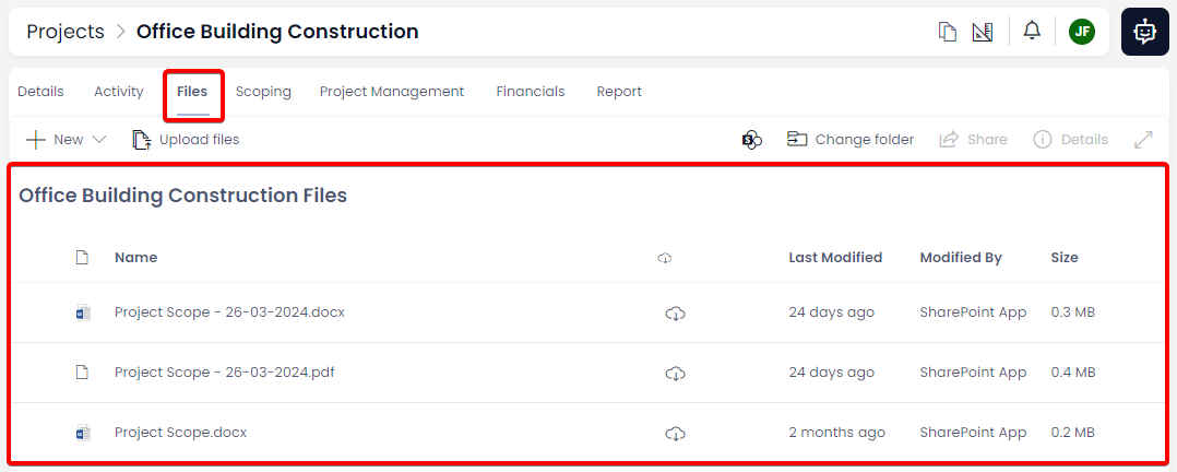
By default, this page hosts two components:
The Files page allows you to:
- Add a new Folder
- Upload files to the existing folder
- Download files
- Preview the selected files
- Renaming files
- Emailing selected files
- Deleting files
- Opening files in Sharepoint
Pages can be Refreshed
If the data within in a page is updated (e.g. by another user, or by an automated process), the page will need to be refreshed for that data to become visible. Refreshing the entire page is not desirable as you may need to reauthenticate, which will take time.
Rapid Platform includes an Inline Refresh button, that allows you to refresh all the items in a page. The Inline Refresh is located in the Command Bar, and has an icon that resembles a clockwise arrow.

Page Permissions
The permissions for a page can be set. This will authorise or prevent access to a specific page. The access permissions can be set for either users or user groups. The Permissions is located in the Command Bar, and has an icon that resembles a house key.

You can read about Item Permissions and how to set Read, Write and Delete permissions.